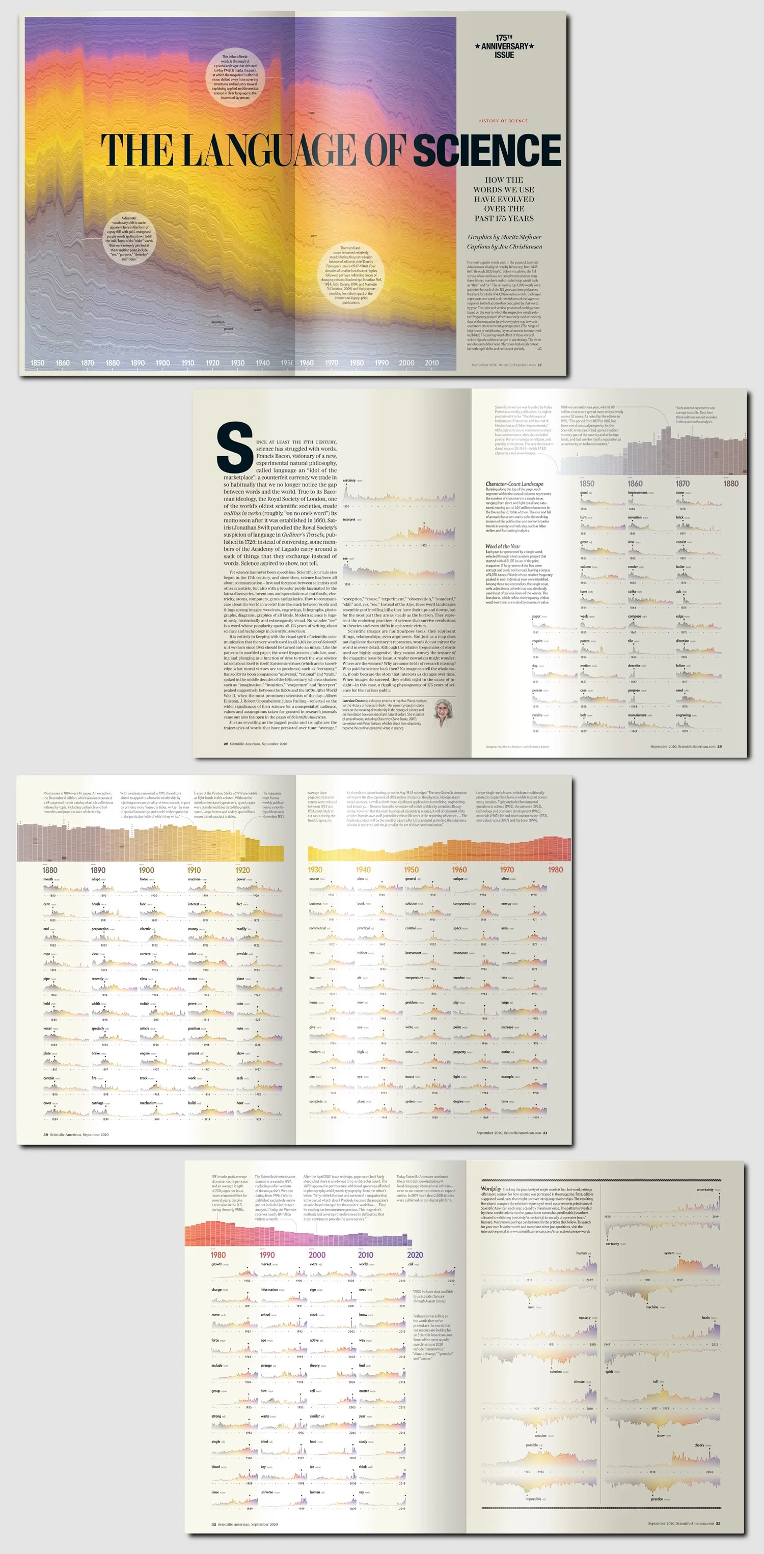
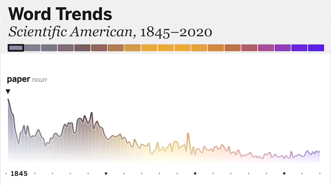
The full corpus up to press date—5,107 issues of Scientific American magazine—provide the basis for a data visualization package that explores the words used in the magazine over time, up through the 175th anniversary issue. Ultimately, that translated into an 8-page dataviz-centric print feature article, a process description sidebar, chart sidebars for the other 6 feature articles in the issue, web formatted versions of all of those print items and an interactive portal (now defunct) for custom word searches. The editorial vision being that the words used in the magazine over time would provide a glimpse at how science—and how we write about it—has evolved over the last 175 years.
I pitched and managed the project, art directed the components and researched and wrote the captions.
Lorraine Daston wrote the introductory essay; Jen Schwartz edited it. Amanda Montañez provided web graphics art direction support, and Ryan Reid provided interactive art direction support. Raja Abdulhaq, Ian Kelly, and Jessica Ramirez assisted with web development. Dan Schlenoff and Silvia DeSantis shared their magazine archive expertise. Christi Keller, Angelique Rondeau and Aaron Shattuck copy edited and fact checked the various components.