For a 2011 Scientific Americanarticle on cosmic inflation by Paul J. Steinhardt, I had hoped to set up a new visual vocabulary for the concept with shape and color, then use that iconography to explain the new ideas. In the spirit of Edward Tufte, I wanted every color, shape, and line to have meaning. Nothing extraneous.
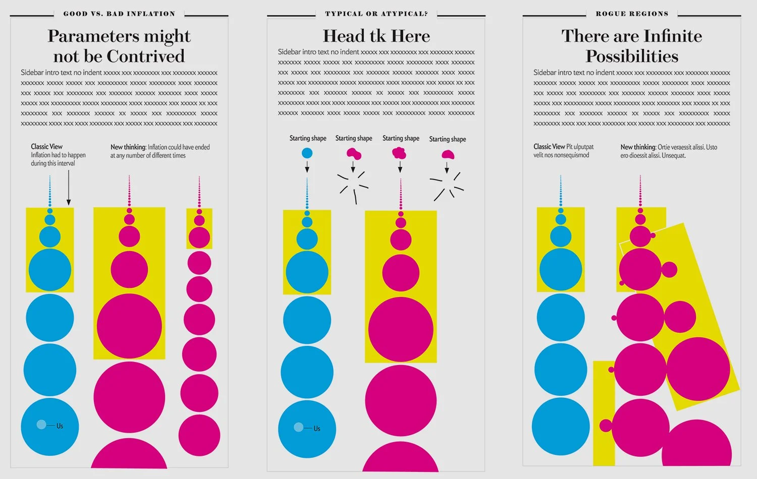
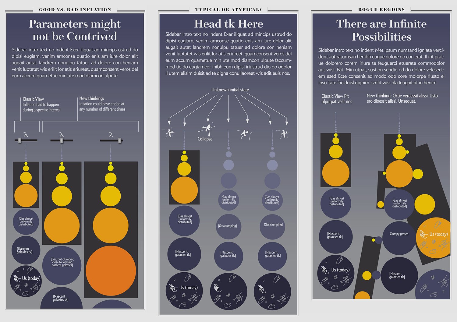
The first graphics box in the article would set up the new visual language. The following boxes would use that language to explain new ideas. In the work-in-progress concept sketches included here, cyan represents the classic theory of inflation. The yellow zone is the period of inflation. Magenta represents the new thinking.
I was so caught up in developing a spare and efficient language to explain the science, that I was taken aback when then editor-in-chief, Mariette DiChristina, asked for something richer and more engaging. I had lost sight of the context for the graphics. The illustrations were intended for an existing audience that love articles about space. And a potential audience that might benefit from a familiar and comfortable visual hook as a welcoming counterpoint to the abstract concepts in the article. By stripping out figurative details, I had lost all visual references to space. And I may have pushed an already abstract concept further out of reach of a popular audience.
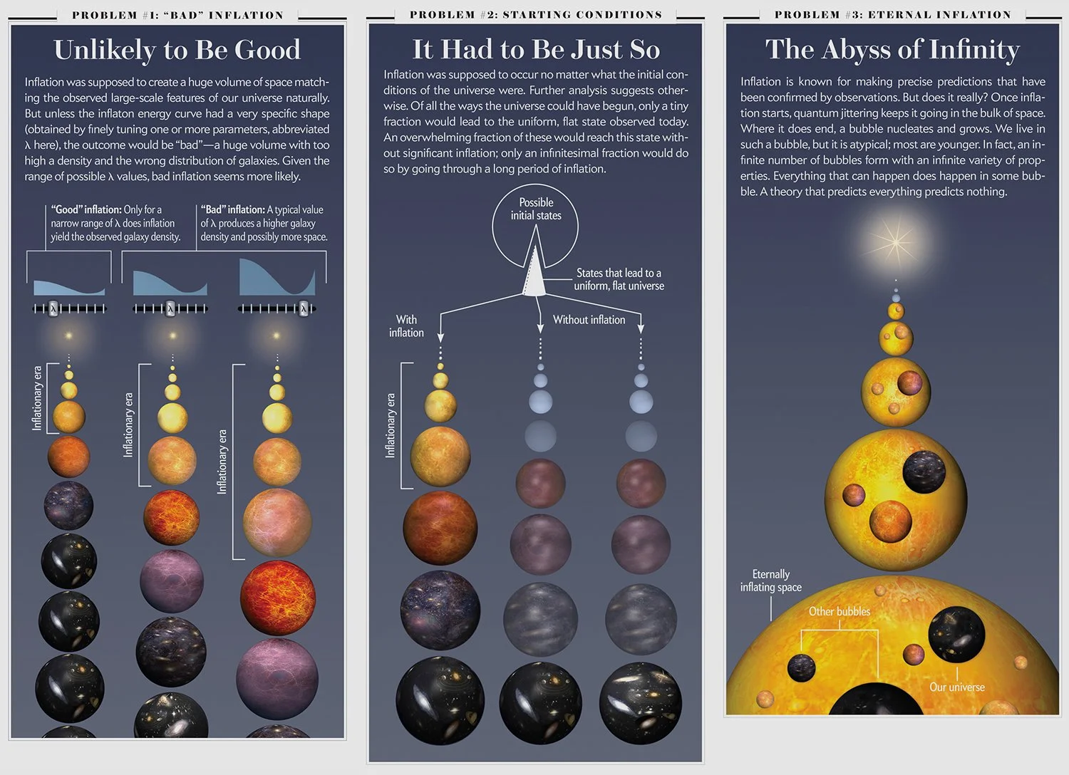
The final art remained pretty faithful to the sketches from a content point-of-view. But ultimately, thanks to artist Malcolm Godwin of Moonrunner Design, the spare iconography shifted towards fully rendered and detailed dimensional shapes. I've grown quite fond of the lush style of the final illustrations. But I think that the spare starting point was key: It forced clarity of intention at the sketch stage.