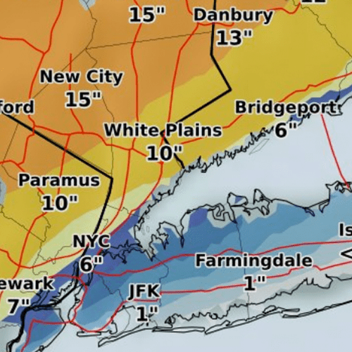
Winter Storm Stella demonstrated the fuzzy edges, shifting nature, and uncertainty inherent to storm forecasting. Early predictions had New York City prepping for a record-breaking—well, compared to past storms in March, anyway—20+ inches of snowfall. But Stella delivered less than eight inches of slush in Central Park. That said, the numbers weren’t too surprising for folks watching meteorologists hedge their bets with talk of shifting snowfall bands along the coast 24 hours before the precipitation began. (Even as the Weather Prediction Center cautiously held to their maximum predictions for NYC). And the storm lived up to the hype in places such as Binghamton, NY, with a 24-hour record-breaking snowfall of 31.3 inches.
Interestingly, though, in the days following the storm I didn’t see folks critiquing visualizations of precipitation uncertainty related to Stella. And when I think of Nor'easters, I think of daily updates of fairly standard radar images and maps with bands of precipitation projections, often in the form of low-to-high ranges. Hurricane projections, on the other hand, are nearly always accompanied by problematic “cone of uncertainty” visualizations.