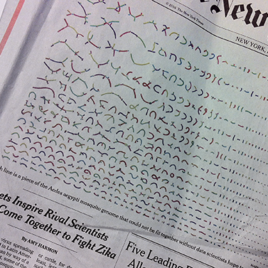
Perhaps you saw this graphic on the front page of The New York Times last week, leading into Amy Harmon’s article about scientists from a variety of labs banding together in the fight against the Zika virus. The researchers’ shared goal; sequence the genome of the virus’ mosquito vector, Aedes aegypti, in the hope that a more complete knowledge of the insect’s genetic makeup will lead to ideas on how to prevent it from transmitting the virus that causes disease in humans. (The last major—although incomplete—sequencing effort was published in 2007).
The New York Times caption (as it appears online) states that you're looking at “A visualization of the recently sequenced Aedes aegypti genome. Each of the 3,752 colored lines is a fragment of its three chromosomes...”
But what does that mean? How do you read the graphic, and how was it built? To find out, I reached out to Mark Kunitomi, author of the chart and postdoctoral fellow in the Andino Lab at University of California, San Francisco.