Pop Culture Pulsar: Origin Story of Joy Division’s Unknown Pleasures Album Cover
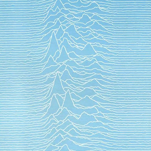
Sure, I was familiar with the graphic—and I’m not alone. Joy Division’s 1979 Unknown Pleasures album cover leaned entirely on a small mysterious data display, printed in white on black. No band name, album title or other identifiers. An interesting move for a debut studio album.
The cover image became an icon but remained mysterious. Even as knowledge spread about the band’s inspiration point–a preexisting pulsar data visualization—the true origin of that visualization continued to be a bit of a riddle. Somewhere along the way, I became obsessed with the narratives behind pulsar discovery and stacked plots, along with a growing desire to learn all that I could about the image and the research it was connected to. This post is an abridged story borne of that obsession, starting with a video screened at a data visualization conference and ending with an interview with Harold (Hal) Craft, the radio astronomer who created the plot from data collected at the Arecibo Radio Observatory.