Thumbnail view of four magazine spreads featuring a range of data visualization types on the topic of menstruation, IUDs, and maternal mortality.

Reproductive Health

It was an honor to work on elements for a special report on reproductive health with such an amazing team: my graphics colleague Amanda Montañez; Jen Schwartz and Clara Moskowitz (text editors); Monica R. McClemore, Virginia Sole-Smith, and Maya Dusenbery (authors of articles that included graphics); and Valentina D’Efilippo and Federica Fragapane (dataviz designers).

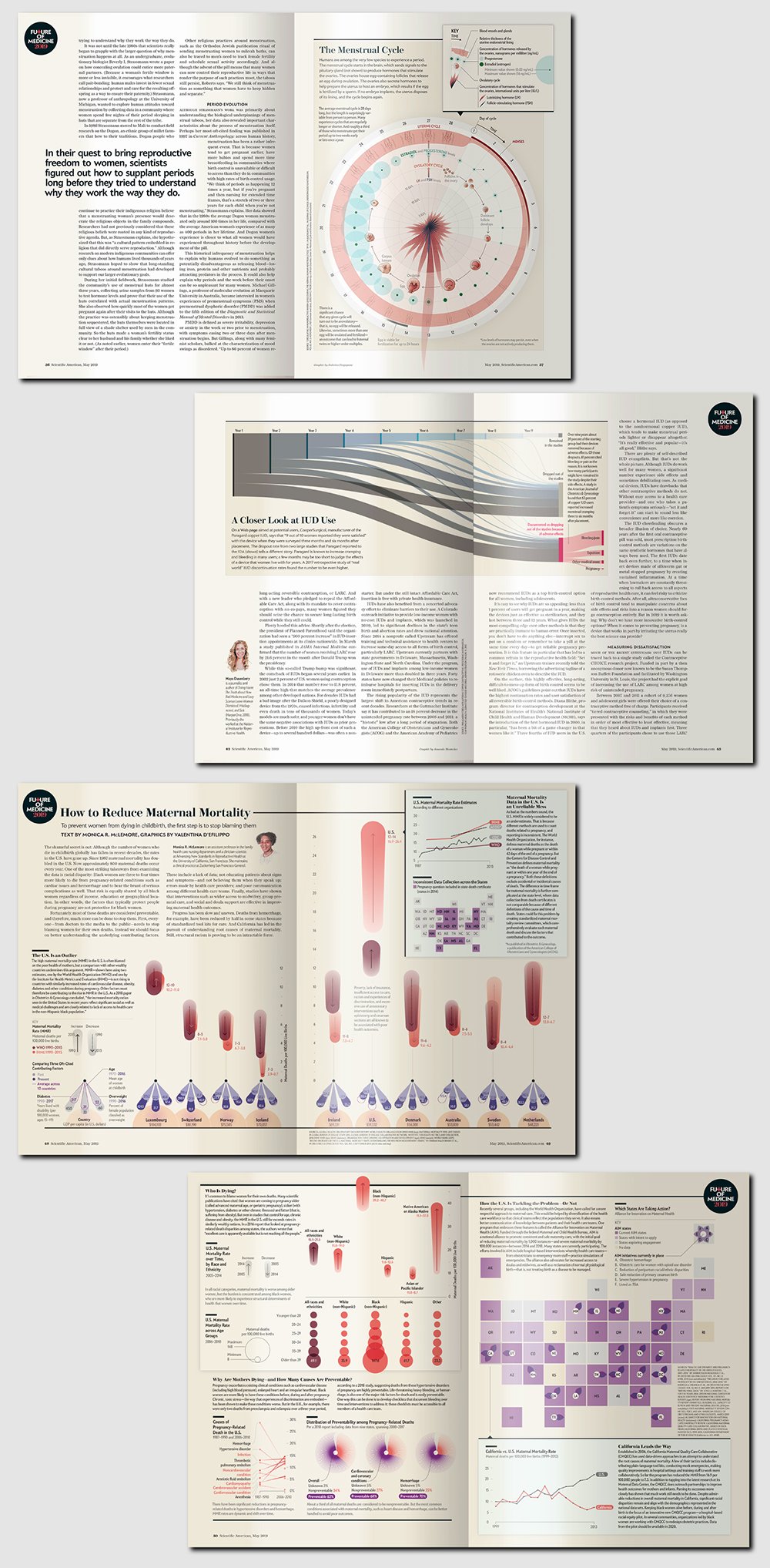
From top to bottom:
The Menstrual Cycle—Graphic by Federica Fragapane; art direction by Jen Christiansen; Jerilynn C. Prior (consultant)

A Closer Look at IUD Use—Graphic by Amanda Montañez

How to Reduce Maternal Mortality—Graphics by Valentina D’Efilippo; text by Monica R. McLemore; concept, research, and initial graphics planning by Amanda Montañez, art direction by Jen Christiansen

For digital versions of these articles, including sources and alt text for each chart element, visit:
https://www.scientificamerican.com/article/what-is-the-point-of-a-period/

https://www.scientificamerican.com/article/why-women-and-men-need-better-birth-control/

https://www.scientificamerican.com/article/to-prevent-women-from-dying-in-childbirth-first-stop-blaming-them/

Previous
Previous

Solar Nanowires

Next
Next

Whale-Fall